Monday, 29 October 2012
Sunday, 28 October 2012
Development on Moon Surface Lighting


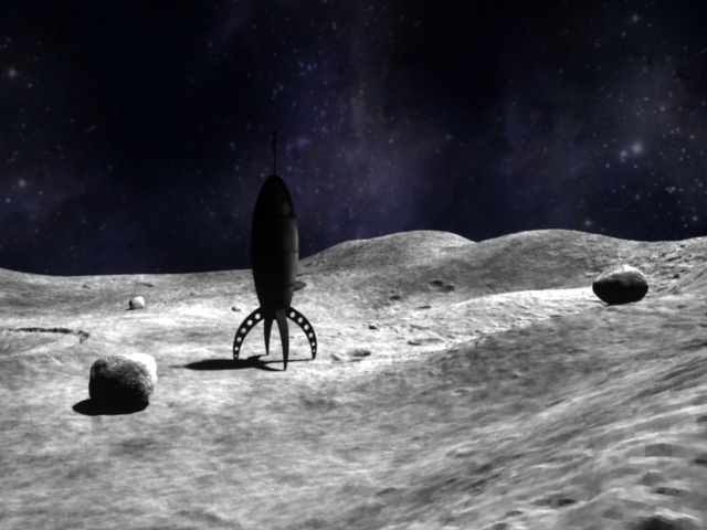
In these render's of my surface, I have been playing around with my lighting with a bloom effect. The top image has Bloom effect at 75% of maximum whereas the middle has it at 50% of maximum and the bottom at 20%. I am happy with the 20% render, and it will be the one I use, because it picks up enough light and dark, tonally without being biased on either end of light or the darkness. The bloom allows me to replicate the actual conditions on the moon, where the sunlight bounces off of the lunar surface but due to the lack of lit area's for the light to bounce back to it lingers over the lunar area; giving a very distinctive look that it has been key to capture. I also have a Spherical UV Mapped background that immerses my environment below. The image I designed myself on Adobe Photoshop to correctly fit around a Polygon sphere.
In Progress

The entire map

Zoom in of above image

The two together...

NOSTALGIC, IMMERSIVE Camera Fiducial's and other artisttic little touches...
In regards to my visual development, I'm wanting to create a key, distinctive twist on something instantly recognizable that I can toy with and make my own. I'm very confident with the Moon surface that I have created. But it's all now about building and building on top of that to create more of an atmosphere (No punn intended). So whilst doing my research, I looked at a lot of Apollo 11 (1969) photography produced by Aldrin and Armstrong on the Lunar surface and you can plainly see the fiducial crosses that the lenses produce on the photo's, so I have created myself a few little fiducial's to composite into my scene in Post Production when the Maya scenes have been rendered out. Minus the black background, these are what I have created. They are at an opacity level of 45% as so the scene will seap through and mingle with the crosses in a way that won't allow these fiducial's to distract from the action in the sequence.

Thursday, 25 October 2012
Jump Cycle
I really wanted to play around with this one, with some help from Richard Williams's Survival Kit.
Wednesday, 24 October 2012
Moon Surface Render Pass

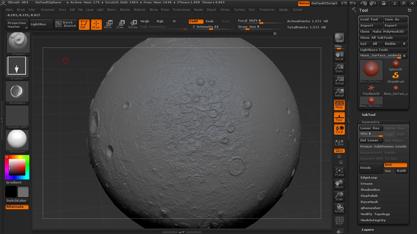
This is the surface of the Moon where most of the Performance and action in my scene is going to take place. While it looks like a basic plane mesh, It's actually been a difficult road to get it here. First of all, the initial levels and higher ground and lower ground area's were simply made in Maya and then exported to Z Brush. In Z Brush, I had a lot of fun being able to digitally sculpt in the craters and the natural/raw texture that the plane has - whilst facing the challenges of learning the Z Brush interface which has been an unprecedented journey for me. Getting that wonderful sculpt back into Maya and getting it back in there efficiently and how I artistically wanted it was the most difficult part. There's a lot of thing's that have to be played around with in regards to exporting all of the detail from Z Brush and getting that back into Maya. The detailed texture itself is a texture Map. This is known as a Displacement Map, and then on top of this there is a really cool velvet texture that I have found through external sources, so it's not a Maya preset. But that gives my environment a really nice and grainy but eased out look that compliments my rugged natural landscape. So really, we have a basic mesh plane with 2 Textured UV Maps laid over to give the artistic representation that I really really desired. I can say I am more than happy with the result! It's been something I have had to persevere with but my artistic representation of the Lunar surface has come into fruition!
Tuesday, 23 October 2012
Moon Layout Original Floor Plan to Z Brush Renders

The original floor plan sketch that I produced. As a colour key, I tried to paint this in as though I was creating a displacement map as so it would be easy to read and I knew specifically what I wanted to create. The lighter grey area's highlight the high-land points in the terrain, where as the darker parts demonstrate where the terrain dips downhill. The craters are the circular area's, however as they dip in at various lengths and each crater is different to the other, it's important to retain that Natural looking illusion that I want to capture.


The first two Birdseye views are my surface layout which will play as the stage for my character performance. The image above, which is a whole-Moon sculpt will be situated in my wide/long shots. The last two images have a started mid-grey texture, unlike the first one which is just a screenshot of the finished sculpt with a default lit texture.
Monday, 22 October 2012
Colourscript, Colour Key Palette's & Production Design

Above is the colour script that I have sketched and then digitally painted in Photoshop. A colourscript is a roadmap for the way colour will be applied throughout my film. It allows me at a glance to see what mood's and feelings I can evoke from a single frame, and the colours and lights that compliment the evoking. It also allows me artistically to try and see where I can fullfill my vision and where I may be going wrong; and it will be a wonderful visual reference for when I am lighting my scene. Colour was always integral in setting the tone of the film here and conveying the right atmosphere. Space is a dangerous, negatively lit place. Stylistically, I have to bump it up visually in comparison with how it looks in real life so I can touch on the moods I want my audience to feel. In reality, from my research, from the moon imagery, to stand on the moon in real life is nowhere near as extravagant as what i'm hoping to acheive which as an artist and a storyteller, I think will give me tremendous freedom that I enjoy exploring.
Colour Keys

The reason Iv'e gone with these secondary hue colours is because not only do I want to try and play around with the colour palette of space, and create something new and refreshing, I want to bring in a colour aesthetic that really stuck by me as a child from Disney's Sleeping Beauty. The colours in that film and the way they are used to elicit moods and emotional responses from an audience and the atmosphere it builds for the film as a whole is something that has always stuck by me but iv'e never really used that form of inspiration before to work with such diverse colours. Here I thought would be a great time to start as i'm not tied down to reality in such a way that I have to follow certain logical laws. I do have a bend of freedom that I feel confident I can enjoy and experiment with.


One of my all time favorite favorite Disney animated films "Sleeping Beauty" employs a powerful colour palette that defines itself against it's predecessors and the Disney films that follow. Stylistically, it stands apart and this is purely on design, lighting and colour.


Minority Report is another stylistically brilliant film that is overly lit and photographically over-exposed in area's but I love the colour palette and the artistic lead that the film is trying to inform us that the film is so brightly flared in places because the future itself is far too glossy and spectacle to contain is the cinematic frame. This, is another example along with other science fiction films that ground them in their genre.
Monday, 15 October 2012
Sunday, 14 October 2012
Norman Goes To The Moon - Final Storyboards

Saturday, 13 October 2012


Sunday, 7 October 2012
Z Brush Moon sculpting tests... TOO CARTOON!


So iv'e been sculpting away on Z Brush, doing some designs and coming up with something suitable for the artistic direction that I am taking whilst also developing said direction at the same time. I think looking at the work that I have done already, and then looking at the design elements to this model, I don't think they compliment eachother. This design while it carries appeal - and could be taken further in a project carrying a simplistic artistic style - it does not suit what I have in mind in comparison with sketches that I have done and what I want to express visually. So I'll be loading up Z Brush this week for another sculpt!
Sketches & Planning
Iv'e had quite a specific vision in mind all along for the benchmark of what I want to acheive so this would explain why the sketches are quite thorough. Aside from watching lot's of Science Fiction films: The Invasion of the Body Snatchers, The Day The Earth Stood Still, War Of The Worlds (The old movies) Alien, Aliens, Prometheus, Blade Runner, Mars Attacks, Moon (The obvious!) these have been fueling a lot of innovation. Then I was watching The Incredibles and some of the old "Duck Dodgers in the 24th and a half century" Looney Tunes episodes and this sort of, pushed me into the direction of giving everything a sort of period look as though, these reflect a period such as the 1950's-60's visualizing what the future would be like in the future; and I really liked this idea, it gave me a lot to play with in regards to modelling.

A side on view of what I hope to acheive to mode, texture, light and animate in Autodesk Maya.
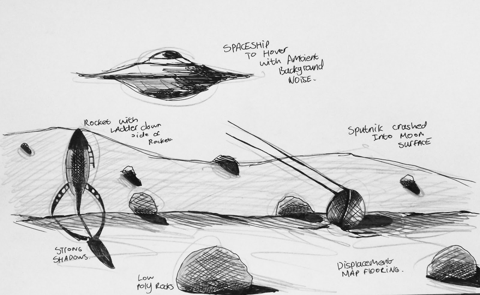
The Rocket design, any loyal retro science fiction fan will know is heavily influenced on the "Forbidden Planet", "Buck Rogers" and "Duck Dodgers" Art style and direction. To keep in with the period science fiction style I wish to achieve, this seemed the logical option artistically - but it also allows me to limit myself to simple poly counts in Maya, and also so that I can effectively UV map the rocket with my own custom UV painted texture from Photoshop which I am VERY excited about doing! I think it's gonna add some real dimension and character to the rocket!


Sputnik 1 was always a design that I didn't want to compromise or alter during the design and modelling stage. This has always been one of the key things that I would always leave, as to so that it looked instantly recognizable so iv'e been sat in a Starbucks just sketching away some Sputnik's. In Maya, I plan to add a rusting, weathered Bump map to the sputnik model. I know this again defies logic in regards to actual Lunar conditions (temperature, atmosphere, how materials react with the conditions) but I think this will build on my weathered, period look and I think that it allows my Sputnik model to stand out from just been an ordinary crashed sputnik model. It is crashed, but it's weathered, worn and rusted - For me, this tells it's own story and I find that very cool and interesting.


The UFO model I wanted this to hit that benchmark of been a flying saucer. A design that visually represented all those conspiracy images/documents/newspapers and all of our historic recordings of what a UFO looked like. I wanted to model it so that it looked leveled - it had some dimension and levels to the design, from top to bottom. I wanted it to looked like it had been constructed practically, and not just absolutely glossed over with an absolutely smooth design that wasn't aesthetically stable to fly - and the sketch matches what I am modelling quite well for the moment, I am pleased with the progression at this stage.

THE STORY

Tuesday, 2 October 2012
Fostering Innovation


Subscribe to:
Comments (Atom)